
Watercolour - Notan Exercise
I've been spending a lot of time studying a PDF version of Composition by Arthur Wesley Dow. I found the book through a link posted by Katherine Tyrrell at Making a Mark. Katherine has been posting some wonderful instruction and references on Composition and Colour over the past few weeks.
The tulip exercise (above) came from the Dow book. As Dow points out Japanese ink painters enhance their harmonies of tone-composition by mingling slight quantities of hue with ink. This exercise involved mixing a set of three grey washes and painting the same design a number of times, gradually increasing the amount of hue mixed with the grey. I find the results quite elegant and it has been a great lesson from that point of view.
I've had a lot of distractions this week because all the art references I have bought on line finally turned up on the same day! I'd been waiting over two months for my 10 minute DVD art lessons with John Lovett. Below are a couple of quick efforts based on John's exercises and reference photos.
The most fascinating aspect of these DVDs is the opportunity to watch Lovett push and pull the the pigment on the paper and the lovely calligraphic marks he makes with pen or liner brush.
 After John Lovett - exercise in Cobalt Blue & Light Red
This was a failure if you've seen the original, so I tested adding some brown ink and spritzing it. Disaster but fun. I learnt a lot.
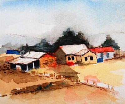 After John Lovett - Outback palette
 After John Lovett - Outback palette
This was fun because the colours are so warm and it reminds me of home. I certainly didn't do John justice in this one. It's only a detail from his bigger painting. I will try another of these with my own outback photos.
Also in the mail came The Simple Secret to Better Painting by Greg Albert and Keys to Drawing with Imagination by Bert Dodson. Can you see why I've been distracted?
Also in the mail came The Simple Secret to Better Painting by Greg Albert and Keys to Drawing with Imagination by Bert Dodson. Can you see why I've been distracted?
8 comments:
Ooh, I love the bottom one! Such great, saturated colors and such wonderfullyjuicy paint!
Robyn, you have such an incredible delicate touch in these. I think they are both excellent and convey different sensations. I'm so glad I didn't miss these and your exercise above.
Oh Robyn!! I so understand!! LOL Last weekend I was torn between Ron Ransom's methods and David Bellamy's methods and I couldn't paint my way out of a tissue box! LOL I LOVE these, though, Robyn, especially the last!!!! I find it mighty challenging to following someone else's methods and it takes MONTHS it seems to make them our way ... good job, hon -- truly!
So how do you like the DVDs??? especially after waiting all this time?
Oh! You've been having fun I see! Good for you. and I have to day I don't care much if your middle painting looks like John's - I think it's simply lovely. So surreal...
Oh I love the first one. So understated. The second one is certainly very Australian.
Laura - Thank you. I promise I will keep trying for juicy colour. Trouble is I live in a grey, stone village - the fruit and veg shop is the only immediate relief!
Mary - Many thanks. I'm about to check out how your beautiful oil painting is coming along.
Lin - LOL. And yes, I do think John Lovett's 10 minute videos are worthwhile. I bought six and there isn't a weak one amongst them. It would help if John would publish the photo references he uses on his website as they are too hard to sketch from during the demonstration. Perhaps I'll suggest that ;)
Judi - Thanks. I'm keen to try another Venice view. I wish I'd taken more water photos last time I was there. I was hunting doors for Lin.
Wendy - Thank you :) Now the challenge is to apply what I've gleaned from the DVDs to my own paintings. I'm just quite happy to sit and watch him paint all day.
I like the way the tulip exercise came out. I've never tried anything like that. I do like the misty tones you have in the painting of the Grand Canal! I also like the warm colors of the outback painting. You should definitely do one from your own photos.
Love the outback painting, just for the heat it gives off and the Venetian is so cool in comparison, they're both beauties.
Post a Comment